10. Seattle Seahawks (White)
The Seahawks have a totally different color scheme here, and the committee (of one) loves it. Action green for a football jersey? It works in Seattle. The white jersey is simpler than the home blues, and it works for this look.

9. Carolina Panthers (Black)
A lot of people like the Carolina blue look, but the black primary with powder blue accents pops. This jersey looks cool. When Cam is running and throwing (and not getting hit because of a porous O-line), he looks so smooth.

8. Green Bay Packers (White)
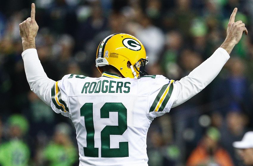
The dark green rings out on these jerseys and almost shines. The typical green home jersey is classic, but this white makes the green radiate the brightest. The dark green is a perfect match for the gold(ish) helmet.
7. New England Patriots (Nautical Blue)
Red, white, and (nautical) blue (and new century silver)? Could you get a more perfect color scheme for a team called the Patriots from New England? The nautical blue accentuates the red face mask and number outline. Everything works here.

6. Dallas Cowboys (White)
This white home jersey is iconic and as American as apple pie. The different shades of blue between the jersey and helmet work somehow. The silver-green is a staple of the Cowboys and is incredibly crisp.

5. Oakland Raiders (Raiders Black)
Remember when the Raiders played in Oakland? Yeah, me too. Having a fan section called “The Black Hole” helps this whole scheme. The raiders silver and raiders black has been an elite jerseys since they were beating up teams in the 70’s. Nothing here is gimmicky or wasted.

4. Pittsburgh Steelers (Black)
Can you make black and yellow without looking like a bumble bee? The answer is yes. Props to the city of Pittsburgh for coordinating their major sports teams colors (Steelers, Pirates, and Penguins) and making them actually work. The three hypocycloids (stars) in the helmet are a throwback to the steel unions. It’s a beauty.

3. Kansas City Chiefs (White)
This is another classic jersey that has stood the test of time (and the AFL-NFL merger). Teams should take note when redesigning future uniforms. The arrowhead logo is perfectly done. The red, white, and gold are simple yet refined. Patrick Maholmes is going to look good in this for a while.

2. Chicago Bears (Dark Navy)
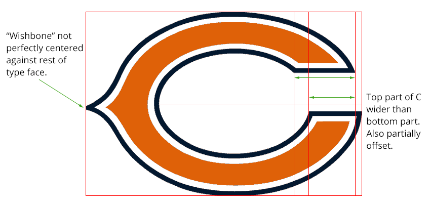
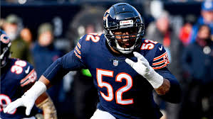
Did you know the the “C” on the helmet is not symmetrical? You know what? It doesn’t even matter. This piece of art has great contrast between the dark navy and orange. The orange sticks out as a number outline. And if you’re asking, the fact that the committee’s high school jerseys were orange and blue makes no difference on the ranking (okay, maybe a little).
1 .San Diego Chargers (Powder Blue)
This is the best jersey in all of sports. When they rock the powder blues, you know you’re in for a visual treat. The navy and gold are accents to let the lighting bolt on the helmet stick out. If you can visually find a more appealing jerseys in professional sports (Oregon football doesn’t count), you’re wrong.

